Citizens Design System
Accessible, multi-framework component library (React + Angular) with Storybook, Sass, and NPM packaging, used across Citizens Bank product teams.
- Role
- Software Engineer, Design Systems · Citizens Bank
- Period
- Jun 2021 – Present
- Stack
- React
- Angular
- Storybook
Problem
Citizens teams need to build digital experiences that look and behave consistently and are accessible. From the public CBDS site:
Citizens Design System (CBDS) helps teams build engaging, consistent, accessible, and cohesive Citizens digital experiences. CBDS provides branding, visual style, accessible UI components, UX patterns, content guidelines, tool-kits, and resources backed by user research and current best practices.
Goals
- Improve collaboration between product owners, designers, and developers.
- Save designers and developers time and budget with shared references and resources.
Components
I build components for the CBDS web component library.
- Reusable UI components in React, Angular, and TypeScript, styled with Sass and documented in Storybook.
- Every component is built for a real use in the bank's apps.
- Shipped as versioned NPM packages used across multiple product teams.
- Figma designs turned into production-ready, responsive, cross-browser components.
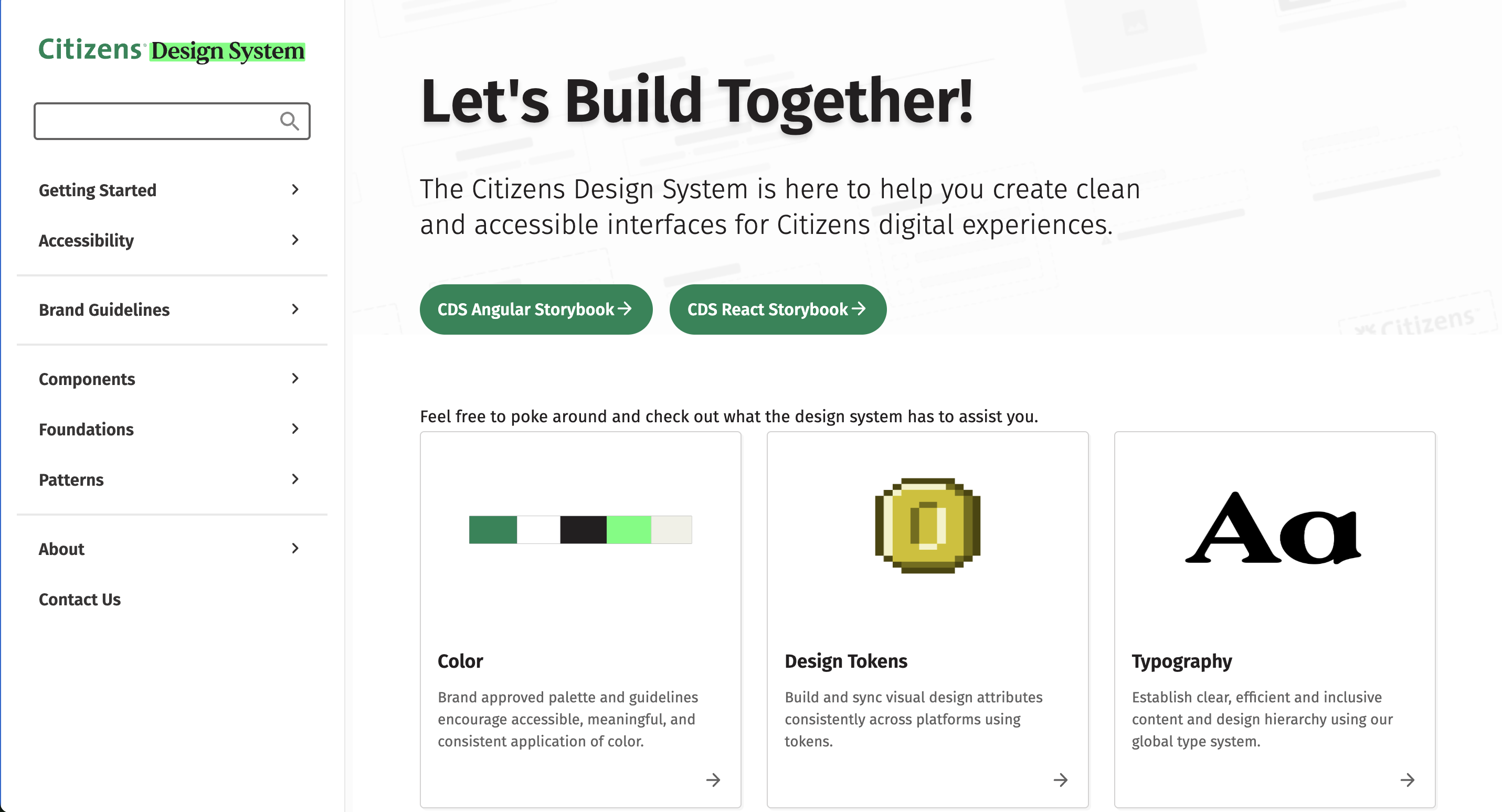
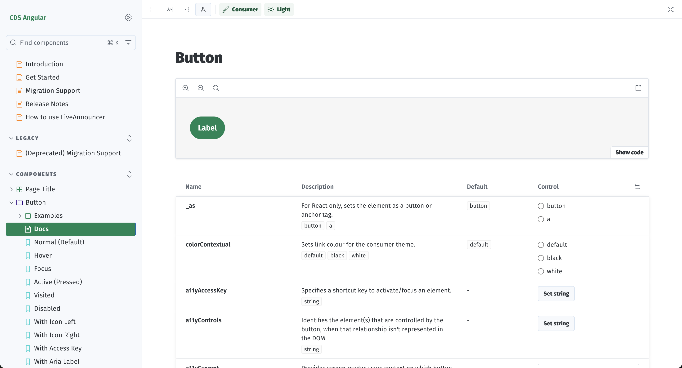
Most components have public usage documentation in the web responsive library, and both frameworks have a public Storybook: React and Angular.
Technical decisions
- Accessibility built into the API. Components take accessibility settings as regular props, such as the Button's
a11yAccessKeyanda11yControls. The accessible option is then the default path for product teams, not something they have to add later. - One source, two frameworks. Each component is written once and published for both Angular and React at the same time. The two frameworks stay in step, and a fix lands in both.
Accessibility
I build WCAG/ADA-compliant components for customer-facing online banking. Each component's Storybook docs cover its interaction states (hover, focus, active, visited, disabled) and its accessibility props, so teams can check the behavior before they use it.
Testing and CI/CD
- ESLint rules and unit-testing and coverage standards.
- CI/CD quality gates on the component packages.
Micro-frontends
CBDS components are used inside micro-frontends (MFEs). I handle MFE integration and coordinate component upgrades across modules that deploy independently.
Results
- Each component ships once to both Angular and React, so every framework team gets the same component, and the same fixes.
- The components are used across the bank's product teams and micro-frontends as versioned NPM packages.
- Usage and accessibility guidance lives in public docs: the web responsive library and the React and Angular Storybooks.
Learn more on the public Citizens Design System site.